Wednesday, May 3, 2017

Contemporary Artistic Response Project

For my final project, I re-created what Vincent van Gogh’s artwork might have looked like if he were to take a postmodern approach. Vincent van Gogh focused a great deal of his artwork on landscapes and self-portraits, so I wanted to use these two key elements of his work in my re-creation.  He was known for his bright contrasting colors and intense brushstrokes which created implied texture and gave the illusion of flow and movement in his pieces.  After printing out various landscapes and self-portraits that Van Gogh created, I noticed that so many of his paintings used the same or very similar colors and color schemes.  After cutting out some of his self-portraits, I realized that they could be placed on different sections of his landscape paintings and almost completely blend into them.  I noticed this trend with four specific landscape paintings of his so I decided to work with those.

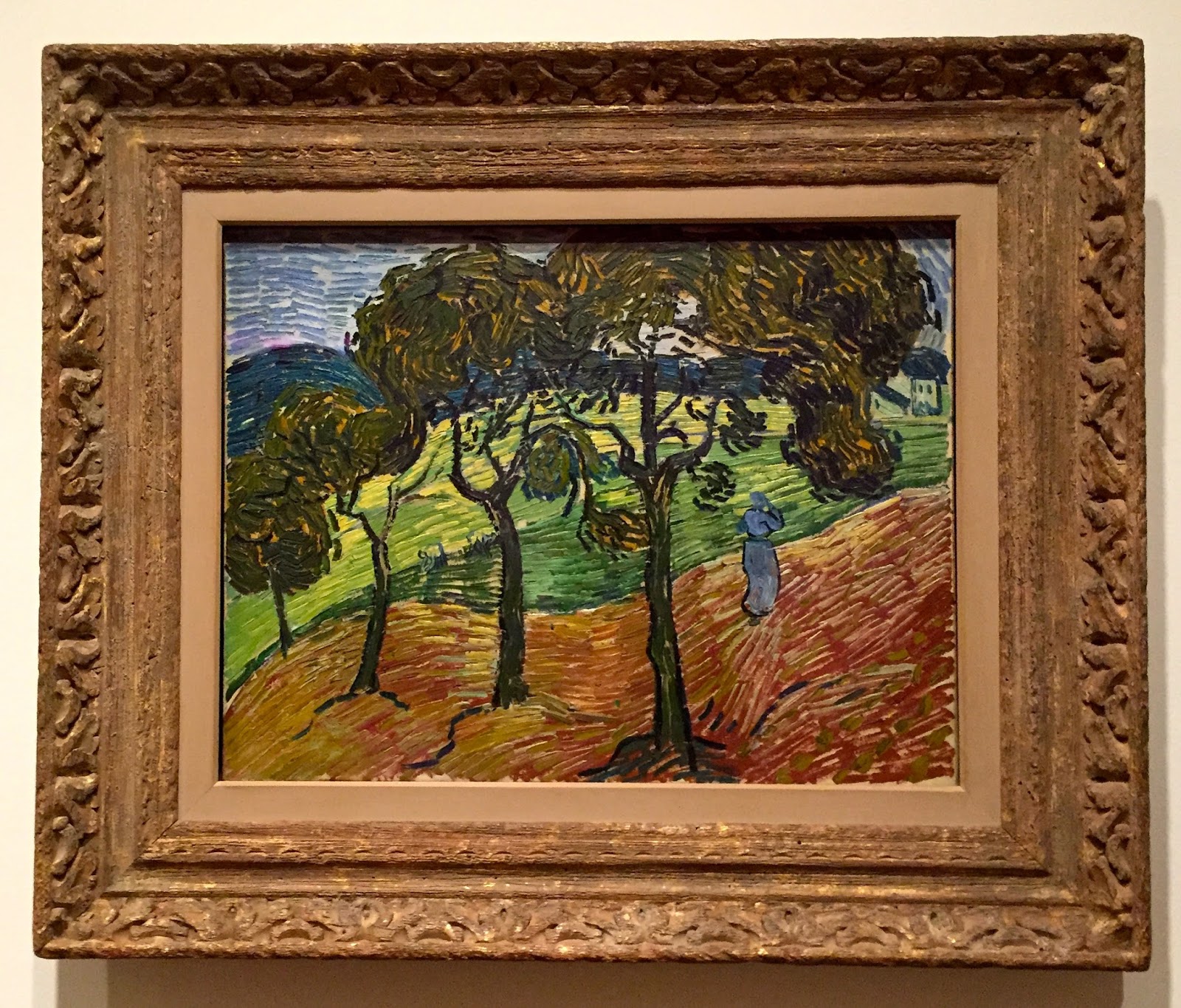
The composition of my piece is divided into four sections which make up one big rectangle.  I used four different landscapes by Van Gogh, so the focal point will most likely vary from viewer to viewer but for me it is in yellow hats at the bottom right of the piece.  My eye then moves about in a counter-clockwise rotation to analyze the other three landscapes.  Van Gogh used complimentary color schemes in his paintings, so each individual landscape has a different combination of complimentary colors.  Van Gogh suffered with depression and mental illness, and critics believe that this influenced his artwork.  I incorporated this into my piece by chopping different self portraits of his, and placing them in scattered fashions within the landscapes, which gives the viewer an unsettling feeling.   This represents the connotative meaning of the piece.  Since the colors in his portraits almost identically matched with those in his landscapes, they appear to blend deeply into the background of the landscapes.  This is meant to symbolize a loss of self, which was something that Van Gogh struggled with, especially towards the end of his life. While the four landscapes appear to be in a symmetrical neat arrangement on the piece at first glance, when you look more closely, one of the landscapes is actually placed sideways.  This symbolizes and calls to attention the fact that while people may seem fine, many people can be suffering with depression or mental illnesses that we are not aware of.  Just like in van Gogh’s landscape paintings which may seem positive at first glance, many of them have darker underlying meanings that are symbolic of his struggle with depression and mental illness.


Overall I really enjoyed this class and feel that I have taken away a lot from it.  My favorite project of the semester was the Advertisement Breakdown.  I am a marketing major and am very interested in the advertisement and media side of the industry.  It was fun to be able to play around with different advertisements to then create a whole new piece based on my visual analysis of one advertisement.  I have an internship this summer for Athlon media group, which is a company that publishes magazines. Our focus on visual analyses of this piece along with all of the other artworks we analyzed has helped me to better understand what advertisements and art might be trying to communicate to the viewer.  This will definitely help me in my internship and even my future career.  I am happy to have been able to express the creative side of me through the projects and assignments in this class and there is nothing that I would really change about it.  

Wednesday, April 19, 2017

Postmodern Mixed Media Visual Analysis

For my Postmodern mixed media project, I started with the quote "A negative judgment gives you more satisfaction than praise, provided it smacks of jealousy."  In the center of the piece, I photoshopped together green images of eyes, snakes, and tigers.  Above the green images, I pasted a picture of the four main characters from the move Mean Girls all wearing pink.  Around these images I used red paint to paint an abstract shaped background.  I then used black ink to add to the background and really move the viewer's eye around the piece.  The main color scheme is complimentary between the green and pink, and the red and black background seems to compete with the pink, making it almost difficult to look at together.

This piece implies tones of envy.  The green eyes, snakes, and tigers in the center give the viewer more negative feelings of jealousy and competitiveness.  The picture of the Mean Girls characters give the viewer a sense of teenage drama and pettiness that often stems from jealousy and lying.  This piece is meant to draw from the typical "mean girl" characters that girls often encounter during high school.  The piece is meant to show how negative judgments often stem from jealousy and only provide you with satisfaction more than anything else.

Tuesday, April 4, 2017

Luminous Connections

Loyola brought Light City to campus with amazing interactive light displays.  The displays included  videos projected onto buildings and walls, as well as musical light displays, and colorful lights near McManus theater and throughout campus.  It was well worth it to stop by and admire this collection of creative, exciting, unique, and bright displays made by students.  One of the most interesting displays that I saw was the one outside of McManus Theater.  It consisted of a built structure with a clear glass window to look through that had an amazing intricate lit up silver display inside it.  On the outside of the structure, people were given the option to write a thought on a silver tag and tape it to the wall.  Bringing Light City to Loyola was a wonderful way for students to express their creativity with unique and fun exhibits and displays.  On one of the descriptions of the event, it explained that the "exhibition signals the emergence of light from the darkness of winter."  This is a really positive message, especially now moving into spring, and the students involved did an amazing job conveying this message on our campus.  Below are some photos from the event.


Wednesday, March 29, 2017

Postmodernism Notes

Postmodernism
  • In the middle ages, it was unusual to encounter anyone with different beliefs
  •  In Postmodern age, it’s common to encounter people with many different beliefs
  • All the world’s cultures and rituals intermix and are all over mass media & cyberspace
  •  “we live increasingly in a world of interconnected differences-differences amplified and multiplied at the speed of electricity”
  •  Postmodern intellectuals have attempted to map the mix of identities, realities, cultures, races, gender roles, technologies, economies, cyber-spaces and mediascapes of our rapidly changing postmodern world
  • These postmodern artists or architects simply take note of the new mix of messages, symbol, cultures and media, and then create a video, song, painting or building that reflects the Postmodern condition
  • 3 cultural periods of which a unique cultural logic dominates
  •  The Age of Realism – the era of the bourgeois, historical novel
  • The Age of Modernism – modernist culture expressed its dissatisfaction with the world; themes of alienation, rootlessness, lack of identity, solitude, and social fragmentation
  •  The Age of Postmodernism – reflect the dislocation and fragmentation of language communities – splintered into small groups – each speaking a “curious private language of its own, each profession developing its private code or dialect, and finally each individual coming to be a kind of linguistic island, separated from everyone else.”
Jean Baudrillard – Hyperreal and Imaginary
  • Disneyland – presented as imaginary in order to make us believe that the rest is real, when in fact all of LA and the American surrounding it are no longer real, but of the order of the hyperreal and of simulation
  • Conceals the fact that real childishness is everywhere


Frederic Jameson – Postmodernism
  • Van Gogh’s painting of the peasant shoes: 2 ways of reading it
  • the raw materials/initial content
  • surface of color à utopian gesture
  • 2nd reading: the work of art emerges within the gap between Earth and World; the meaningless materiality of the body and nature and the meaning endowment of history and of the social
  • Andy Warhol’s Diamond Dust Shoes: random collection of dead objects hanging together on the canvas
  • Differences between the high modernist and postmodernist moment between the shoes of Van Gogh and the shoes of Andy Warhol:
  • The emergence of a new kind of flatness or depthlessness, a new kind of superficiality in the most literal sense
  • role of photography
  •  color: bright utopian vs deathly black and white
  • a kind of return of the repressed in Diamond Dust Shoes

Tuesday, March 28, 2017

The Shape of Time

In George Kubler's, The Shape of Time, Kubler discusses artists' biographies and how they are limited in that they are unable to completely depict how an artist's life is related to his or her artwork.  A biography simply focuses on that one single artist's life, making him or her the main unit of study.  The problem with this is that an artists work goes beyond just the artist, but the events and experiences that have surrounded and shaped the artist as well.  Kubler also discusses talent and how one's talent cannot be measured by degree of talent but rather on the kind of talent.  He also discusses various conditions which reinforce talent such as physical energy, durable health, and powers of concentration.

Wednesday, March 15, 2017

Data Visualization

Far more data than we are able to process surrounds us in our every day lives.  This is why data visualization has become such a common practice in today's world.  The process of taking data and incorporating it into visual experiences through the media encourages people to envision and perceive the data and hopefully find some personal meaning within it.  In Edward Tufte's video, Julie Steele discusses that data visualization is more than just a creative process, but actually more of a linear process of decision making based on three basic principles that should always inform your design.   The first is what you want to communicate as the designer.  The second is accounting for the reader's own opinions and biases and how they will perceive the data.  The third is the data itself and how it informs the truth.  Since we as humans, have brains that quickly recognize patterns, a lot of information can be communicated visually at once.  This is why using colors or images for specific audiences is important so that you can appeal to your audience emotionally and get them to quickly engage with the information.

One lesson that I found particularly important in the video was at the end when Tufte says that it is important when we are looking at data or information, that we see it to learn something from it and not just to confirm something we already believe.  So often, people tend to look at data and see it as something they already think they know or believe and use the data to confirm these preconceptions.  The purpose of collecting data is to then learn something from that data.  It should serve to provide revelations, or show us something we have never seen before.  It is important that we always keep our minds open to learning new things through data visualization.

Monday, February 6, 2017

Ways of Seeing

In John Berger's "Ways of Seeing," Berger discusses the ambiguousness of perception and how it can be altered when viewing a piece of art.  Berger talks about some of the negatives and positives that result when pieces of art are replicated.  He especially emphasizes how reproduction of artwork can make its meaning ambiguous, but also can assist in making it easier to connect our experience of art directly with other experiences.

One insight that I found to be particularly interesting is that because paintings are silent and still, they easily lend themselves to be manipulated.  I found this to be an extremely valid point because by adding movement and sound or isolating specific details with a camera, a painting's significance can be drastically changed.  For example, Berger displays a painting by Van Gogh on the screen with no music or movement.  At first it seems like a normal painting and the viewer is able to come up with their own view of its significance.  He then notifies the viewer that it is Van Gogh's last painting before he committed suicide and displays it a second time with sad, dark music playing in the background.  This dramatically changes the viewer's perception of the painting because the background story as well as the background music contribute to an overall sad and dreary essence of the painting.  This goes back to Berger's point that "as soon as the meaning of a painting becomes transmittable, this meaning is liable to be manipulated and transformed."

Another interesting insight discussed is how the meaning of an image can be changed according to what you see beside it or what comes after it.  I was intrigued by this insight because this method is used everyday in the world of advertisements and marketing.  Just like adding music or movement to a painting, displaying certain images, words, or clips before or after an image can manipulate the image's message or meaning.  This meaning could be very different from what the image's original meaning might be without those additions.  This is another example of how drastically a person's perception of a piece of art can be altered.

Sunday, January 29, 2017

Baltimore Museum of Art Visit


During our previous class we visited the Baltimore Museum of Art, which holds a wide collection of historic, contemporary, and modern art.  This was a great experience, especially since we have recently been discussing the power of art.  This visit gave us the opportunity to exercise our imaginations and admire a variety of pieces, as well as focus in on a select few.  Three paintings that stood out to me during my visit coincidentally happened to all be paintings of landscapes.  I was intrigued by how each artist took a simple aspect of nature and portrayed it in their own creative ways.  These paintings are a perfect example of how person can express oneself through their own artwork and everyone’s portrayal of something so similar can come out so different.  These endless possibilities of expression are what make art so fascinating.

Flower Beds in the Dresden Gardens – Ernst Ludwig Kirchner

This was my favorite painting that I saw at the Baltimore Museum of Art.  The first thing that stood out to me was the bright pink colors used in the background and in the detail of the painting.  The bright pink and yellow colors of the flowerbeds contrasting the dark green trees around them emphasizes the liveliness and beauty in the gardens.  I also like how the shapes of the flowers are not very defined, so when looked at closely, it might be difficult to decipher what the painting is, but when looked at from afar it appears to better resemble a garden.  These undefined lines and seemingly random blotches of color allow for a more open interpretation of the painting, which made me want to stare at the painting for long time..  Overall, I love the positive and carefree energy that this painting gives off and every time I look it, I notice something new that I like.

Landscape with Figures – Vincent Van Gogh

This painting was one of the first to catch my attention with all of the sloping hills and swirling trees.  One thing that I especially admire about it is how it is made up of detailed lines which seem to flow in the same direction.  This causes my eye to move about the painting in a rhythmic manner, which gives me a very calming feeling whenever I look at it.


Painter in the Olive Garden – Henri Matisse


I love the ambiance in this painting by Henri Matisse.  Pictured in this landscape is one of Matisse’s favorite models, Henriette Darricarrere, sitting behind an easel, painting her own landscape.  Henriette was a talented dancer and in this painting she is described to be “dwarfed by the large olive trees above her that bend into decorative arabesques.”  As this statement describes, the curving trees give movement to the painting as if inspiring her to dance.